

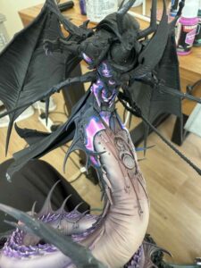
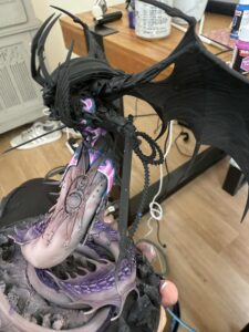
Hi guys! Welcome to my first post for the blog! Today I’m going to go through how I went about tackling the armour of the monstrous model that is Fulgrim! So first of all, how on earth does one approach such a behemoth of a model and make him slightly different to the usual Fulgrims you may see? Well my theory was these guys are the embodiment of excess, the dudes that pump themselves up with combat stims and drugs just to feel something in battle. So to try and do this justice and have a subtle nod to the lore and try to maintain some of the old armour colours, I tried to approach it with vibrant colours and contrast was my main goal, at least on the armour. So let’s get in to how I approached the armour…
What you’ll need:
Paints:
Warpainters Fanatic:
For the Pink:
Royal Blue
Wicked pink
Pixie Pink
Pink Potion
For the Turquoise NMM:
Deep Azure
Hydra Turquoise
Turquoise Siren
Neptune Glow
The Process
Important point about layering!
Start out with a black primer, no need to Zenith, we want to work from a black here and build through the colours that are outlined in the desctiption. Some of the colours we’re going to use famously have bad coverage so this will take quite a bit of time, so be patient and work through the colours I’ve outlined and work in super thin layers. Now there’s no exact science on this and plenty of good examples of how to thin down paints on the internet, I myself will be having a video coming out purely covering layering on my channel, Warp Palette studios but there’s plenty of content out there to get a good understanding of it. I’ll leave a list of good links for YouTube videos that cover it, at the end as this will be used on pretty much every step of the process.
The Pink:
In the pictures below it shows the completed stages but you can see the progression of the pink as it builds to the centre in a thinner line, creating the reflection effect for the pink reflective armour. The base colour here is regal blue, which is a great colour to start off with for pink weirdly. This application wants to be thin and apply 2/3 thin coats. An important point here is ensure that each layer is completely dry before working on the next one, if you don’t then you can create textures on the armour which isn’t going to look good.
Next we go with Wicked Pink, which is naturally thin so won’t need much thinning itself. But you wanna approach this wide and only leaving the recesses as blue, but as you build up opacity keep going in to a smaller area than before and build towards where you want the light, but this will cover a large part of the process, this can take a fair few layers, probably like 4/5 per different shade of pink to achieve a smooth enough transition to sell the effect.
Then we do the exact same thing with Pixie Pink building opacity slowly and building towards the area you want the light to sit, but bare in mind, your aim here is contrast, so don’t build the transition over too big of an area. Follow the picture for advice on light placement.
And we do it again with Pink Potion, but be sparing with this as it reads close to white so too much of this can overpower the area or if the line you build to is too big, it’ll take up too much area and read a bit weird.
Fixing mistakes:
If you find you’ve made the mistake of putting the brighter colours in the wrong spots or your not massively happy with a transition, you can just apply another SUPER thin layer over of the previous colour to blend the last transition in a slightly different area, it took me a while to get this smooth!
The Turquoise:
We’re following a similar process here and try to keep the lighter areas in the same place as the pink, so the lighting all makes sense.
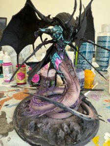
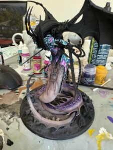
So our base coat here is going to be deep azure, this covers really well but keep the paint thin still and approach it in a couple layers so we keep these armour panels smooth.
Next following the same process as the pink sketch your light placement with Hydra Turquoise nice and thin, blending up from the Deep Azure, to maintain contrast try to leave some of the deep azure showing. If the blend isn’t smooth at this stage apply a thin glaze of deep pure tinting the Hydra Turqouise in to the base coat.
Then following the same process layer with Turquoise Siren. Again pulling this in to a smaller area following the same placement of the pink till you have full opacity and glaze the Hydra turquoise over these two break points to smooth out the transition.
Next do the same thing with Neptune Glow following the same process and glazing the previous colour over the transition.
Finally a mix of white and Neptune glow to push the contrast.